Toggle Image
The Toggle Image component is a control panel component that displays a different bitmap when it’s input pin is high or low.
Toolbox

Breadboard Footprint

Schematic Symbol
N/A
Description
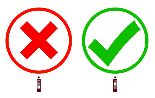
The Toggle Image has a single pin which can be configured on the top of image where Pin = top the bottom of the Image where Pin = bottom. The ```Bitmap On`` Image is shown at runtime when the Pin is HIGH.
The voltage is considered a Boolean HIGH/LOW and the light is ON or OFF. PWM Fading is not modelled.
SPICE
The Pin is a voltage sink with infinite impedence
OpenVBB
The Pin is a voltage sink
PinOut
| Pin | Name | Description |
|---|---|---|
| 1 | In | Determines the image state |
Properties
| Property | Default | Description |
|---|---|---|
| Pin | bottom | Determines how the location of the Pin relative to the image |
| Bitmap On | GoSignImage | The image shown when the Pin is ON |
| Bitmap Off | StopSignImage | The image shown when the Pin is OFF |
| [Width](#width | 128 | The width of the displayed image in pixels |
| [Height](#height | 128 | The height of the displayed image in pixels |


Bitmap On
Bitmap selected using Image Editor Image Editor
Bitmap Off
Bitmap selected using Image Editor Image Editor
Width
The width of the displayed image in pixels. The underlying bitmap width is scaled to this width. The displayed width is multiplied by the dispay zoomfactor so if you store a higher resolution image it will appear less pixelated at higher resolutions.
Height
The width of the displayed image in pixels. The underlying bitmap width is scaled to this width. The displayed width is multiplied by the dispay zoomfactor so if you store a higher resolution image it will appear less pixelated at higher resolutions.
Useage