Breadboard Design Sheet
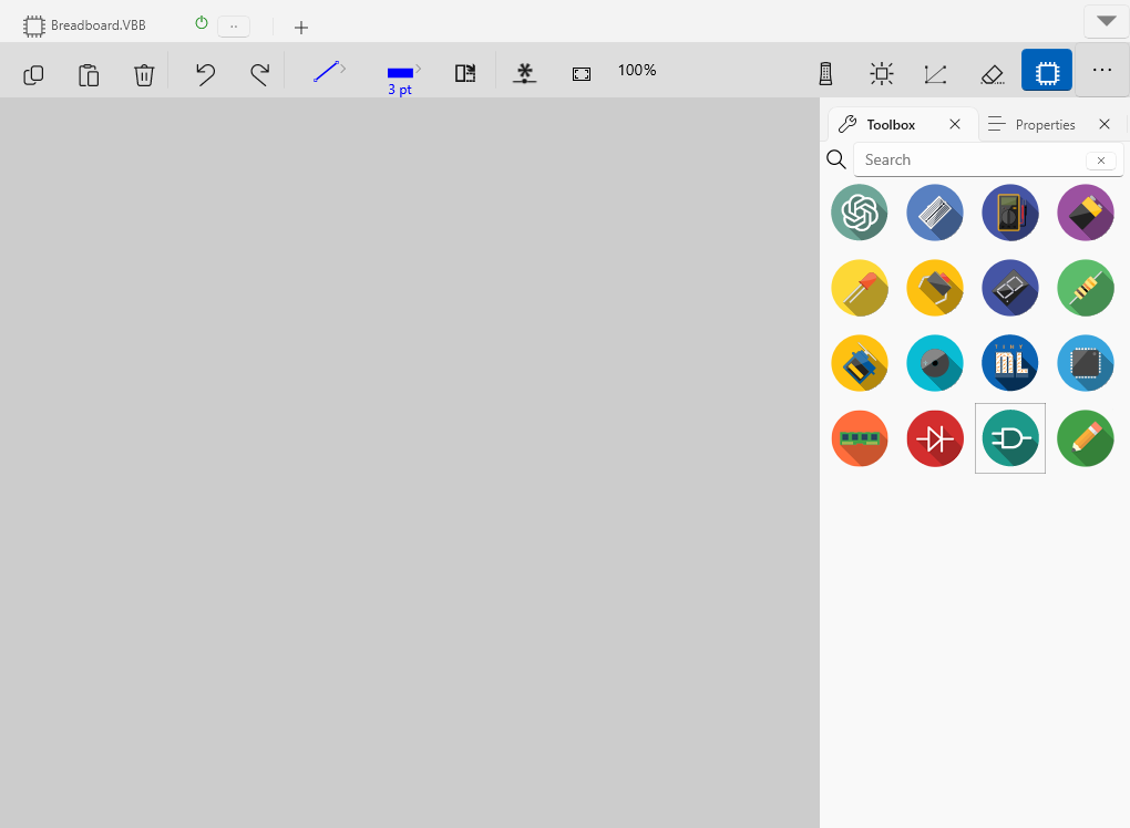
The Breadboard is the primary Design Sheet in VBB and consists of a collection of components wired together to create a circuit.

Breadboard Sheet : Graphics Canvas for laying out interactive circuit visualisations
Ribbon Tools : Select, Move, Pan edit modes toolbar
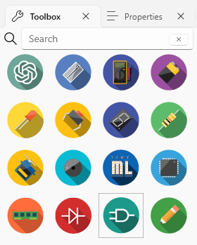
Toolbox : Select, Move, Pan edit modes toolbar
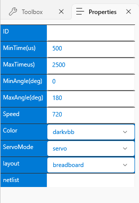
Properties : Select, Move, Pan edit modes toolbar
`Mouse Actions`_ : Zoom-In, Zoom-Out toolbar actions.
`Context Menu`_ : Zoom-Origin restores the zoom and pan factors
`Drawing Context Menu`_ : Additional context sensitive actions
Breadboard Sheet
The Breadboard Sheet is where components and wires are placed to create circuits.
Ribbon Tools
Icon |
Action |
ShortCut |
Description |
|---|---|---|---|

|
Copy |
CTRL+C |
Copy selected components and links |

|
Paste |
CTRL+V |
Pastes the previously copied components and links |

|
Delete |
DEL |
Deletes the currently selected components and links |

|
Undo |
CTRL+Z |
Undo the previous edit |

|
Red |
CTRL+Y |
Redo the previous Undo edit |

|
Link Color |
Dropdown |
Select the current link color from the dropdown |

|
Link Width |
Dropdown |
Select the current link width from the dropdown |

|
Rotate |
Space |
Rotates the currently selected components 90 degrees |

|
New Net |
Adds a named net pin |
|

|
Zoom Origin |
O |
Restores the zoom to the origin and 100% zoom factor |

|
Spice Mode |
Toggle State |
Run simulations with SPICE analog circuit evaluation mode |

|
Animate Mode |
Toggle State |
Animate links with current flow in SPICE simulation modee |

|
Show Nets |
Toggle State |
Show the hidden links between named net pins |

|
Hide Wires |
Toggle State |
Hide the wires only showing the components |

|
Show Toolbox |
Toggle State |
Show the Toolbox / Properties pane |
Toolbox
The Toolbox contains a wide range of electronic components, including resistors, capacitors, LEDs, integrated circuits, microcontrollers, and more. These components are used to create and simulate electronic circuits.

Properties
The Properties control allows the properties of selected components be viewed and modified. When you select a component in VBB, the Properties control displays various attributes and settings related to that component, enabling you to customize its behavior and characteristics.

Left Click
Selects a component and populates the properties
(+ Shift) an unselected component appends a component to the selection list
(+ Shift) a selected component removes the selected component from the selection list
Starts a link if mouse over a pin
Ends a link if drawing a link and over a pin
If drawing a link and over a wire places a junction and connects the link to the junction
Double Left Click
Quits drawing a link if drawing a link
Right Click
If over a component Shows Context Menu
Quits drawing a link if drawing a link
Right Mouse Down
Starts Pan Mode if not over a component
Starts draggin the selected components if over one of the components in group
Right Mouse Up
If dragging selected components drops them into new location
If panning stops panning
Mouse Scroll Button
Scroll Up to Zoom-out. Zoom will center to the location of the mouse.
Scroll Down to Zoom-In. Zoom will center to the location of the mouse.
Additional special function actions are accessed from the more actions dropdown